Riga, the non-official view

Before coming to Latvia, I asked Marika Piņķe, (the Culture and Public Affairs Officer) to arrange a few meetings for me with local publishers. The first one was Ms. Renate Punka from the Janis Roze Publishing House. This is one of the well established Latvian publishing houses. Among the things she had shown me, I liked this Japanese inspired book by Anita Kreituse, that somehow manages to remain very Latvian. (What makes an illustration Local? that’s what the “I am from here” exhibition is all about. Stay tuned…)

Next stop was the complete opposite: Liels un masz (“little and big”) is a very hype, young publishing house. It is run by one of the coolest young publishers I’ve ever met outside of the Bologna children’s book fair: Alise Nigale, strives to constantly think out of the box. I saw some crazy books she had published, including one that used photography as a new form of illustration.

חיות1Latviešu zvēri, By Inese Zandere, Creative director:  Mārtiņš Grauds, Photography:  Kristaps Kalns, Graphic design:  Rūta Briede un Artis Briedis

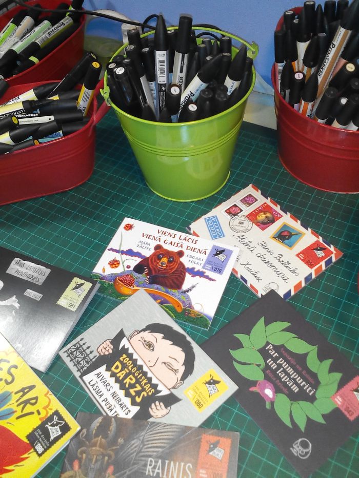
And a lovely series of small paperbacks , titled “Bicki Buck”. This series features a wide scale of outstanding children’s poetry, visually interpreted for children by artists of different styles and genres: graphic artists, painters, stage designers, textile artists, animators etc. they sell for a Euro each, and I got quite a few. You know how sometimes contemporary illustrations look like to much of the same thing? Doesn’t happen in the Bicki-Buck series. Each one of the books is a small masterpiece.

biki.jpg

The creative director, and art editor of this series is a fellow illustrator, Ruta Brieda (Her husband, Artis Briedis, is the Graphic designer). Ruta, besides being one of the funniest, nicest and smartest people I had the pleasure to meet, is my complete opposite in terms of illustration. To begin with, her books are published under her initials – “R.B” Being the diva that I am, I just don’t get it! If I could have my full name on a cover, like Donald Trump’s name on a building – I would do it already.  Ruta’s art is simple, light handed, yet – smart. There are no unnecessary details. She is a minimalist. I told you, the complete opposite of me. Opposites attract, so I was told – and we did become friends right away.

ruta2

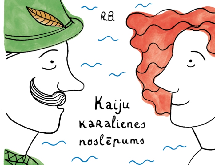
Here is a link to Ruta’s delightful art http://www.rutabriede.lv

Ruta invited me to attend a student review at the art-academy where she teaches. Here’s the thing: After dealing with young artists for, well… most of my life, I don’t buy the theory of young artists being brighter blah-blah-blah. I have met some artists who were more fresh and innovative in their 70’s than most of their students. However, some artists pop up immediately. In this case there were 2 young people I couldn’t help but notice. It turned out both of them were exchange students. A word about the assignment: the Latvian art-academy  doesn’t have an illustration faculty. Most of the students (I take it that some of them study visual communications and others study various techniques of print) had their first brush with the concept of illustration. They came up with a nonsense tale (each student contributed one line to the story, and the outcome was goofy, to say the least), and tackled it at the best of their ability.

The first student who caught my eye was Davor Dmirtrovic from Croatia. He created a monumental book (something you can only do as a student, and later on – maybe once in your life). His bright use of acrylic, and snarky sense of humor couldn’t go unnoticed.

DSC_0613

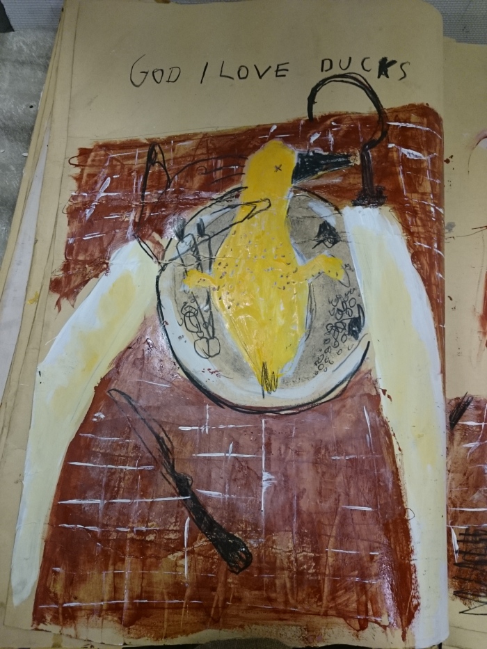
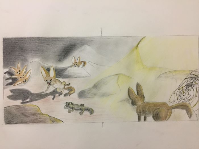
I found the fact that he chose to cook and serve the hero of the story, hilarious.

After looking at many projects – some better than others, I noticed a tiny device – something between a light box, and an old-fashioned magic lantern. It was placed in a corner, and above it – there were strange artifacts that looked like nothing I could make sense off. I was intrigued.

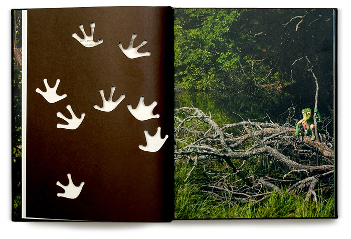
In the box – there was a scroll, slowly moved by a little handle. Much like a child, I was lured in by the promise of adventure, and stood by the young artist for 10 minutes, as she patiently unfolded the scroll to reveal a wonderful story, made with great patience and love for small details. essentially, it was the same goofy story of a duck, but she took it seriously. She used the text as a platform to create an illustrated silent book, that could never be published as a book (given the method of her presentation). What she really did was offer me a unique experience. Not a flashy, loud spectacle – but an intimate, exquisite show that much like the little objects she found on the railway near her home – was not handed to me on a platter. Now THAT is a big deal. Only very few artists I know had delivered their teachers (and their guests) a full experience instead of a solution to a specific project. Most of them became very famous in later years.

sophie2

Sophie gave me a tiny present: a matchbox, with an interesting image printed on it. I joyfully accepted it  (I collect matchboxes). But before we left, she ran outside, to the freezing wind, and gave me another gift: a tiny print (1 of 2 copies), just to say “thank you” for telling her how special she is. In a few years that would be common knowledge, but I will be the one to own a print by Sophie Kurzer, from Germany! here is a link to Sophie’s site. Take your time with it… sophiekurzer.tumblr.com

Now we had to go upstairs as we were invited to the chambers of the rector himself. Usually, a rector’s office is, ah… an office. You have the desk, you have the executive  chair. You have the filing cabinet,  the dusty computer, the miserable cactus, and the slightly broken Venetian blinds – the usual stuff. None of that was the case in Aleksejs Naumovs’ chambers. He has antique style lumpy sofas,  a huge old-fashioned desk, a great view of the city, and a lot of beautiful art on the walls (Mr. Naumovs is an artist and an illustrator). As I was helping myself to another piece of hand-made, fine chocolate, while going through his books, I thought I could get used to this.

naumov2
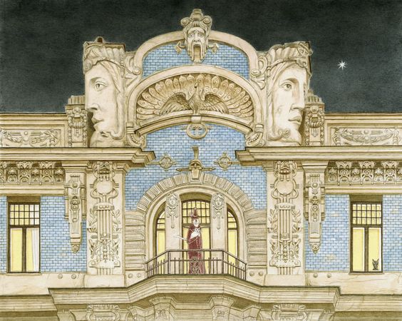
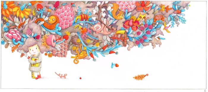
Aleksejs Naumovs, from: “Ahoi! Plūdi Daugavā”, by: Juris Zvirgzdiņš, Zvaigzne ABC, 2014

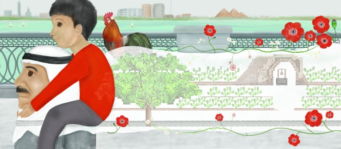
At the very end of our visit, entered Mr. Naumovs’ wife – the renown Latvian illustrator Anita Paegle. I actually knew Anita’s art from before. I used one of her illustrations to demonstrate the concept of locality in picture books, in the lecture I gave during the IBBY conference, a few days earlier.

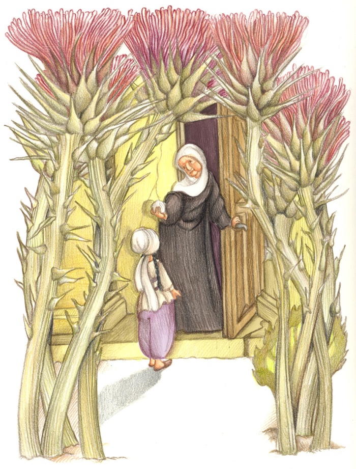
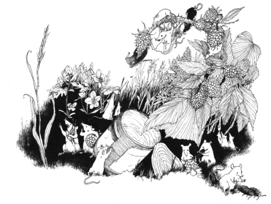
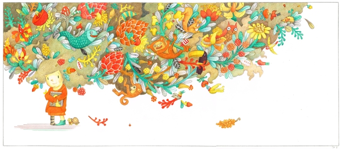
Anita Peagle, from  “Ods nokrita no ozola”, 1990

Mrs. Peagle is a very local artist . She uses her city as a basis to wonderful adventures, drawn in watercolors . I’ve read somewhere that when she started out – there was only one publishing house in Latvia. If that is so – Then she is truly the mother of Latvian  illustration, and I was honored to meet her.

peagle4

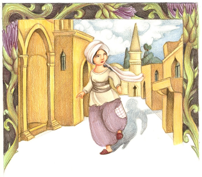
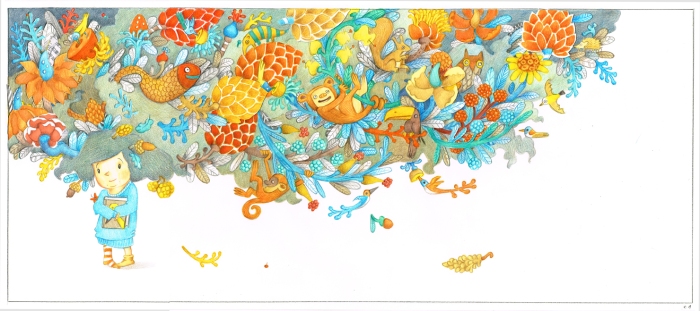
Anita Peagle, from  “Kad karaliene bij Riga”, 2001

There was another interesting person I met in Latvia, that I really need to mention. Somewhere, between ambassadorial dinner parties and art school reviews, we took the most interesting tour in Riga. Riga is “the capital” of Jugendstil architecture (Otherwise known as “Art nouveau”.

riga1

What random visitors rarely get to see is the less famous neighbourhood of the local wooden houses – the original style of architecture, that was pushed aside by the fancy faces and nude figures on the Art nouveaux buildings. Maybe it’s because the wooden houses are more traditional, or maybe it’s because they were inhabited by the not-so-well-to-do people, but they were snubbed by UNESCO. There is no awareness, therefore – no funds to preserve them, so they slowly decade or get run down for newer projects. A young group of people, who grew up in these parts, are devoted to saving the special spirit of the place. They formed a small company, that offers a free storytelling tour, in that  part of Riga. My instructor, Ieva Laube, is a writer, and she gave us the most interesting 2 hours tour, in perfect English. If you go to Riga, be sure to contact these guys, at http://agenskalns.berta.me/  or https://www.facebook.com/AgenskalnsFreeTour/  And help save a lovely, authentic part of one of the most beautiful cities you’ll ever see. On that note… That’s all for today, folks!!!

“I am from here” in Latvia

A couple of years ago, I’ve  curated a retrospective exhibition of Israeli children’s books illustration, dating from 1948 (The year Israel was founded) up till 2014. It dealt with the representation of locality and changing ideals in illustration, and was quite successful. Originally it was designed for a specific gallery, located in the central library in Tel-Aviv. Later it was also exhibited in “Ha’Arava Sapir center”, in the south of Israel. Since the exhibition was financed by the Israeli ministry of foreign affairs, they started translating and exhibiting it in different countries. Sometimes I get consulted with, interviewed or even invited to openings – and I usually accept the invitations because, well, I like going places and meeting people in  far away places – da!, especially if they are from my line of art. This time, I was invited by the Israeli embassy in Latvia. I used to vacation there with my family, when I was very young, and really wanted to go back – plus, it was my 25th wedding anniversary (I’m not really married, but my partner and I count the years since the day we first met. We moved in together 2 weeks later). Since Riga is probably one of the most romantic cities in the world (and one of the very few cities where architects from different ages actually treated each other with respect, while adding another layer to the city) – it went without saying.

riga1

We packed our bags, and went on 2 different flies (mine was paid for by the embassy, his wasn’t), to meet each other in the Riga airport, and discover my suitcase, along with all my beautiful cloths – was somehow lost in Russia. “No worries” I said to myself. “A little shopping had hurt no woman before”. In the meantime, my hubby took care, as usual, of the form-filling part of it (and here is why I was so calm about it, relatively speaking), and we went to the “Astor hotel” to begin our adventure.

We were warned by Marika Piņķe, the Culture and Public Affairs Officer (I can’t really think of her as an officer, but she is the most efficient project manager I’ve ever met) – to be very punctual, and dared not disobey. Marika met us at 10.00 sharp, and took as to the grand library of Riga, where I was expected to make various decisions regarding the hanging of the exhibition. Here’s the thing: The exhibition (that includes art by 72 artists, some featuring more than once, and narration – so it reads like a story) was tailor-made for a specific location. Each new location presents new challenges. I’ve had posters stapled in the corners, and things shown in wrong order. Once I was even confronted by the weird idea of hanging some of the art on the windows of a given space (on top of the red plush curtains). “We assumed you will say YES” answered the disappointed crew when I asked them why they never mentioned this idea earlier. The Latvian crew, led by their fearless leader – Silvija Tretjakov, The head librarian/producer, was extremely professional though.

DSC_0056
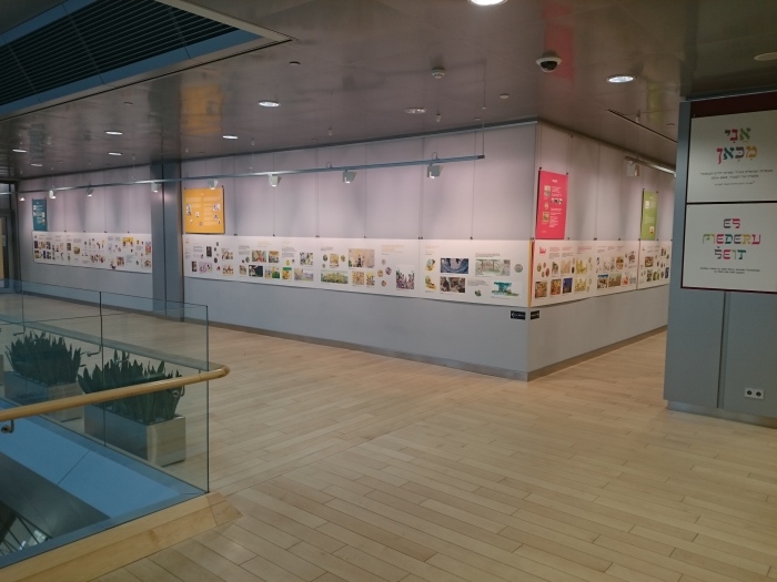
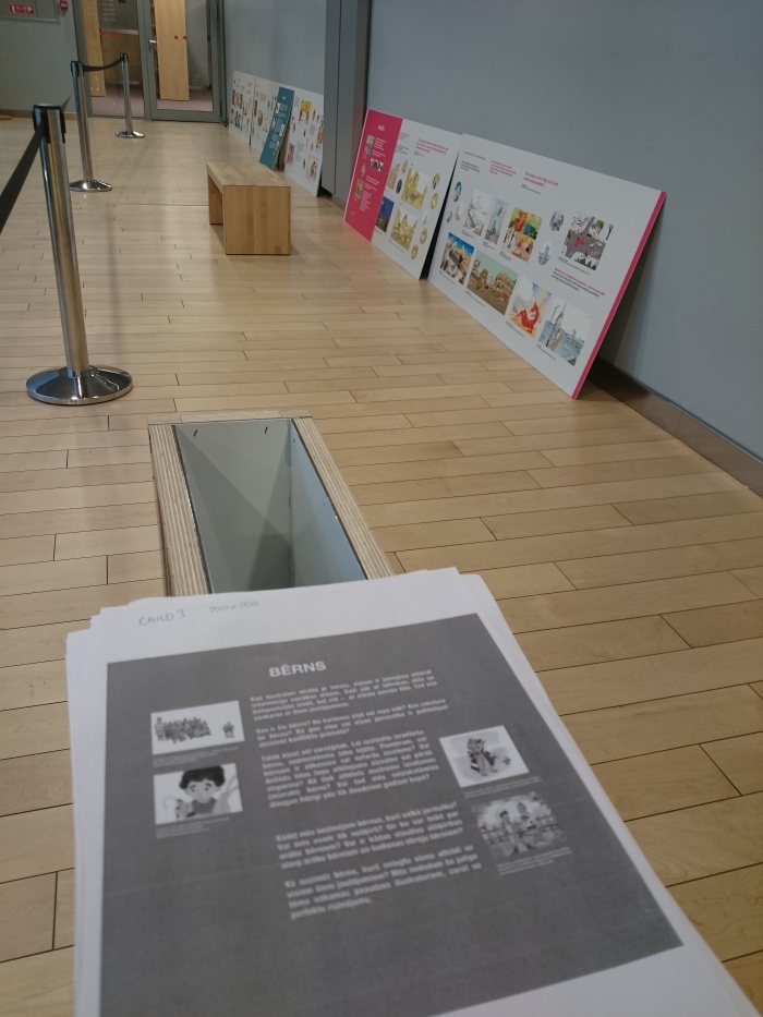
Everything is lying on the floor. That’s how it usually starts.
DSC_0028
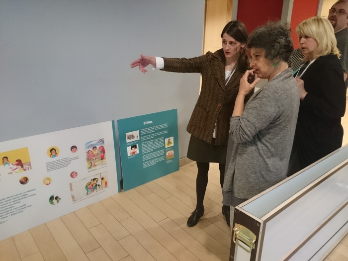
And there is always a problem. Here, for instance – Marika (The beautiful blonde on my right), and Madara Daudze (who is in charge of the hanging process along with the very nice guy in the back) – are trying to figure out where to hang the colored panels. they were made specifically for separate columns in the original location, and tend to pose a problem in every new one.


DSC_0036
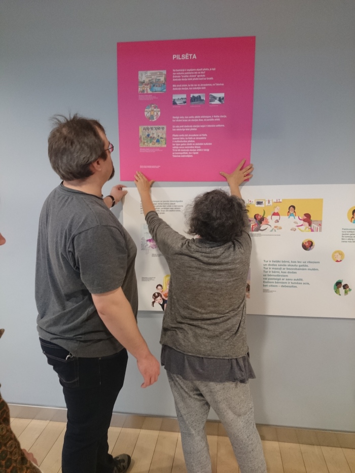
A-n-d problem solved.
DSC_0068
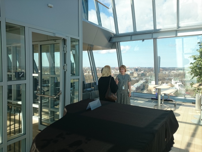
Time to see Riga from the library’s Rooftop. Marika is seen from the back, Silvija from the front, mine is the pointing finger in the middle.

We had about 40 minutes of shopping (I managed to buy 2 dresses, but didn’t get around to buying shoes), I joined Marika to 2 interesting meetings with local publishers (I’ll elaborate in a different post, as it involves art and people I want to pay a special tribute to). Then we had 20 minutes to buy shoes – and went for the obvious option – Zara. It’s easy to buy shoes in international shops – as we tend to know what they have. That proved itself beneficial – as I chose my shoes in 15 minutes. The problem is – Zara don’t really let their customers actually WALK in their shoes. The shoes are clipped together and it’s a “Buy me – or leave me” kind of thing. THAT proved to be terrible. Later on I found the shoes don’t fit my feet, and had to stumble along for streets upon streets in shoes that hurt like hell, to the official ambassadorial dinner, held in honor of the exhibition.

DSC_0190Ouch!!!

Here is the thing with ambassadorial dinners (I’ve been to a few): Once you’ve passed the slightly menacing guard at the gate, it can go either way: The much dreaded official way when everyone is cordial and stern. Every now and then someone asks: “So how do you find our fair city, Mrs. Grossman?” and you nod politely and say “Quite lovely indeed” and then everyone turn silent again until a brave guest dares ask: “Could you pass the bread?” and so on. I really wanted this dinner to turn the other way, for the sake of my husband. He had never been to one of them before. lucky for us – it was. Liron Ben-David, the Israeli ambassador in Latvia, is a warm, funny and genuine person. I knew most of the people at dinner (We had Marika, Silvija, Madara and Aiga – Silvija’s assistant, who is my go-to person regarding anything I want to know about Riga , and specific people in it. Also attended mr. Tzevi Mirkin, the deputy head of mission. We had a lot of fun, many laughs, and I can’t say anything else, as I gave the ambassador my word that whatever goes in the embassy – stays in the embassy!

DSC_0194

Next day We had a free morning. we checked out Riga’s Art-noveaux museum, and in the afternoon, we went to the main event  – My lecture in the Ibby conference, and the grand opening of the exhibition.

The lecture was translated simultaneously to Latvian. That meant 2 things: 1. The basic ideas of my lecture need to be written on the slides, so that people can read them at their own pace (I wish we had the time to translate them. We didn’t.) 2. I had to give up on many of my jokes, shticks, and running around the stage, as it would provide extra difficulties for the translators to do their job. I tried, but I’m afraid I got carried away and relapsed to my usual chaotic way of delivering lectures. Sorry, translator team. I know you did a marvelous job of it – some people who were there and spoke Russian (A language I speak, but not well enough to give a lecture in) – told me.

DSC_0389

And finally, the grand opening. Now I’m not a grand-event-person. I didn’t get married on account of it being a colossal waste of money. I didn’t want to dress up like a cream cake, and sky-dive to a chocolate fountain with doves flying over my head. Every time the concept of marriage was brought up by our families – and after checking the excess prices of dresses, rings, cakes and other wedding paraphernalia – we chose to spend the money in exotic countries. Also, there’s the fact that this exhibition has been going around for quite a while now, so it wouldn’t be my first time at the rodeo. The opening in Riga, though, was touching and I was deeply moved by it. We were happy to see that the hanging was well executed.

DSC_0353

Also – There were many people (my biggest fear, always, is to come to a grand opening, where only I, my husband, and both my divorced parents are attending…) But it was also the excitement of being in a place I knew as a child. There was a welcoming feeling to it – as if someone I once knew, and haven’t seen in a while, was whispering in my ear: “You made it, child”…

Between 2 books


2 years ago I was asked to illustrate a book. The book was about an awkward kid – who lives in complete chaos – but that’s what she is about, and she likes it. Original, audacious, messy, unruly, rebellious, smug – these are things people often say when they describe me. I identified with the little girl in the book more than ever before. It didn’t say so specifically – but I thought the girl should be the complete opposite of typical girly characters in picture books. I wanted her to be fat.. I wanted her to be a bit “ugly”.  Here is my first try. 1-2 B lr

Being the very first run – my editor and the author wanted another option. At that point, Iris and Ed came for a visit. Iris is one of my oldest friends, and she lives in London, so I miss her. She is also a funny, messy, witty girl, with red hair and an attitude to match. I wondered if I could reflect her intelligence and anarchistic character, by simply creating a picture-book character, based on her.

iris lr

Since “Iris” is a stylish kind of brat, I had to change her world accordingly. the new world is to be stylish and organized. A world that doesn’t enable the strange and excentric. 2לר בלי טקסט

While my editor thought this version was really nice, the author wanted a complete change of the main character. As painful as it was,  I felt it was a lose-lose situation: I would have to compromise on my vision and the author wouldn’t get the book she wanted. We mutually decided to go our separate ways. I posted the character on Facebook, just to say “Goodbye”.lr

The next morning I got a message from Jonathan. Jonathan Yavin is a prolific writer, and columnist. We’ve been talking for years about working together, but somehow we never did. “I know it’s crazy” said Jonathan’s message “but the cutie with the birds in her head really inspired me. I’ve written something. Check it out”.

Jonathan’s story starts like this (Jonathan translated only the first lines of it, as its official translation will not be in rhymes): “It’s partly a fairytale, yet some of it’s – true; There once was a mane under which – a girl grew”… Unlike the original story that was about a girls perception of herself – Jonathan’s story is about 2 entities:  One is a little girl (Her name in Hebrew means “Mane”) – and the other is her hair. the girl wants to do as she’s told, and be what is perceived as “a good girl” – but her alter ego – that hair – does whatever it pleases. One day, the girl wakes up and discovers 2 cockatoo chicks in her hair. She embarks on a journey to retrieve the chicks to their mother. Since the mane is such a main character in the story, the character needed to be altered.5לר

This was great as a concept drawing, but we really couldn’t have a whole book with the entire city in the girl’s hair. I mean – we could, but it wouldn’t work with the text. then I came up with this. I thought it would make a great first page.

2לר

This was well accepted by both Jonathan and Dalit Lev – our editor. I  made a few concept drawings for a scene where the girl rushes down the stairs to save the terrified chicks. I did those just to establish a visual language for this book. The first one was based on the visual language I created for the other book. My editor loved it – Jonathan – not so much.

3לר

Then I tried a different style (mainly because a friend told me the previous day, that my style was no longer innovative. however, being someone else wasn’t really working for me).

4לר
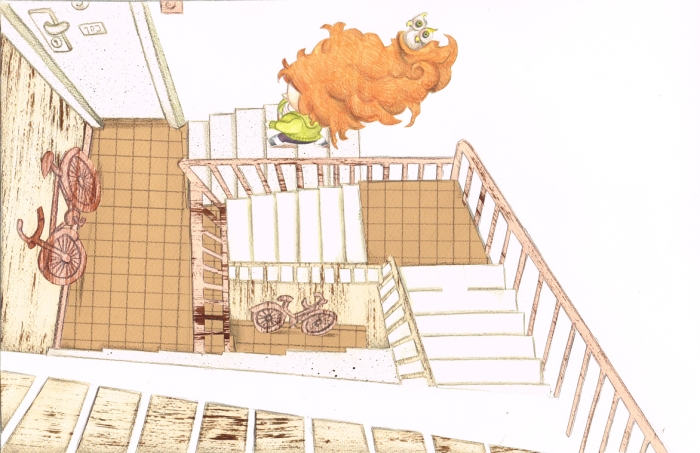
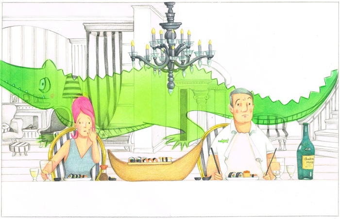
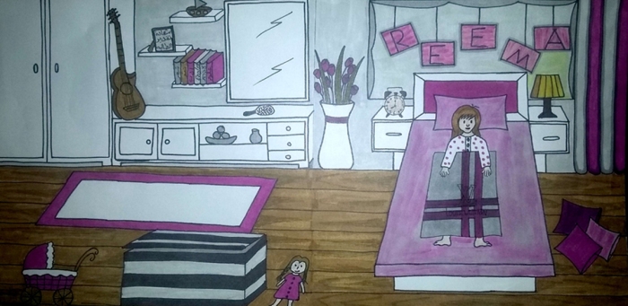
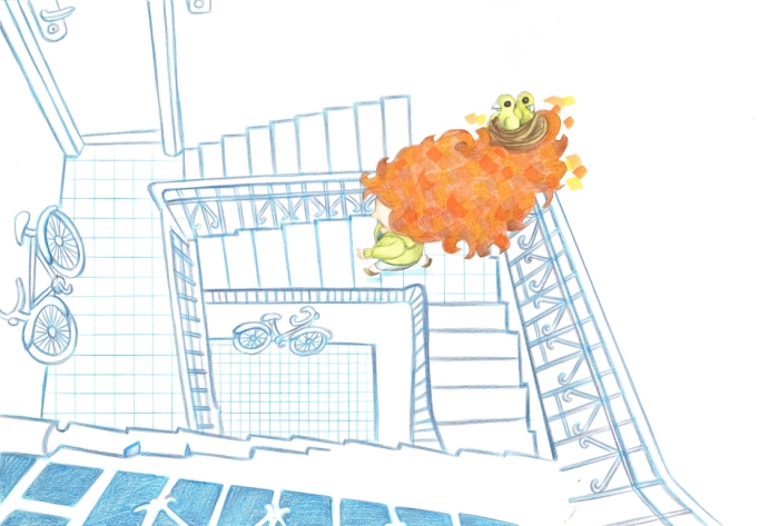
Then I thought it would be fun to try an Esher inspired stair-case. Jonathan thought it was great but our editor didn’t. That, I think, Is a good point to stop, and explain: Working on a book in The states, or in Europe is very different from working on a book in Israel. In Europe and The States – the writer is never involved in the visual aspect of the book. An illustrator works along-side a graphic-designer, an art-director, and an editor. In Israel, the author has an equal say in everything. It’s sometimes frustrating, but after all – the author and illustrator are equal partners, and I think that’s the way it should be.

1לר

Our editor didn’t like the color scheme. She asked if I could try something else. By this point, I was working on the book for so long, I couldn’t tell one color from another. I did the reasonable thing: I made 3 versions, and asked my Facebook friends,  to vote by “liking” one of them. here is the Tally of the votes: The art director and the editor liked this version, but not the majority of the public. Dalit Lev, the editor said this version was the most easy on the eye, in terms of seeing all the details. I felt that it wasn’t the right choice, since I’ve used this color scheme in a previous book, and it felt like going backwards.1בלר

this version was actually the most popular amongst my Facebook friends – including Jonathan.

1אלר

And this version was almost equally popular by the crowds, with one major difference: all of my colleagues – artists I respect, and am inspired by – loved it. I decided I’ll trust them. I remembered my editor’s note on seeing the details. I set for a long time in front of the first version, until I “deciphered” it.

1

At some point in the book, I did change my technique in a “dream” scene, when the girl wakes up to the chirping of the chicks, but is not sure she is quite awake yet. I figured I don’t need to apply a new technic. that would be too weird. I just used the colored markers I normally work with as an undertone – without applying colored pencils above them.

גרסה חתוכה 3ב

Jonathan wanted the various shop names to be a bit funny. In this illustration – the clock-shop owner looks a bit like Dali, and of course, there is a Dali clock in the window. using Dali was, actually, Jonathan’s idea. I really resented the fact that he was the one to come up with it, but had to admit it was brilliant. I added the melting clock. If you can’t beat them – join them, right?

7

Here is why I love this story so much: It is not vain. It’s not about loving yourself but rather about caring for others. While everybody around are occupied with their looks, and make nasty comments about  little girl’s hair – she is focussing on aiding nature. She strives to reunite the helpless, vulnerable chicks with their mother. That makes it a story about compassion, and in the cynical reality of our world – That’s a story I’m proud to be telling with my art.10


Concept drawing class 2

SOOOO… Let’s talk about my students, in the advanced illustration workshop for the Arab sector in the mixed city of Shefaram. I have 7 students, who excelled in the basic workshop held the previous year. I asked them to pick stories that depict their life, their culture and their values.

During our first lesson, I gave a lecture, that was basically similar to my last post about concept drawings, and asked my students to create a concept drawing for their book. My main goal was to see their chosen technique, their color scheme, and more importantly – the way they tackle the task, without really knowing anything yet. At the end of the process, we will compare the end results with these first attempts, and appreciate our progress.

Muhammad Jabali wrote his own story about a fox, who is trying to steal some oranges for her starving family. the story itself has no specific cultural attributes, so if these are included – it must be via illustration. Here is his first try:concept srawing.jpg

It was made digitally. I had 2 problems with this:

a. The technique. Muhammad never worked with digital illustration before. I think that learning a new technique is a monumental task, and it couldn’t be done without somewhat neglecting the equally enormous task of learning the basics of children’s books illustration. Please bear in mind that these guys didn’t take a gazillion courses in painting, drawing, color, composition, etc. There’s only this program, that equals one course in art school.

b. The wall. initially I thought he was referring to the wall running through the West Bank between Israel and Palestine. In this case, it would mean that the fox is grateful for the existence of the wall (for it prevents him from being caught) – and that would add a political undertone to a very simple book. I didn’t know if it was Muhammad’s meaning, and what message was he trying to convey. it turned out that Muhammad had nothing political in mind. he just didn’t know how to tackle the fence he mentioned in the story.

After a visual research class, where he studied various foxes, He decided he will go for a Fnac (a small fox, native to our area), and that also means he now needs to be specific in portraying the area, along with its flora and fauna.

fnac

The next concept drawing he made was this:

unnamed.jpg

This was made with real pastels. it is not yet perfect technique-wise, but he is way more comfortable with it, and I believe it will be improved with time and practise. The work itself is much more interesting. This scene is about the hunt of a lizard . There is no such scene in the story itself. Undermining the text is a wonderful thing, I constantly do it myself as an illustrator. His attempt at doing that made me real happy as a teacher. once a student does that, it means he understands the story – and furthermore – he understands the art of picture-book illustration. techniques can be acquired – this can’t.

Suad Khamaisi is fairly comfortable in her technique – markers. I think this is very important that she has her own “style”, as she has so many other things to learn. the story she chose is a very lovely, simple story for toddlers. A girl plays with her mother’s scarf, and in her mind it becomes an umbrella, a tent, a snail…  Suad’s initial try looked like that:

לילה 2.jpg

I really liked the details Suad has added to her art (in a story of this sort – the more details you add, the more things you can do with them later to enhance the narrative. A teddy bear, for instance, can suddenly get up and dance with a doll) What I didn’t understand was the double take on the same image. Suad explained she thought she was supposed to show EVERYTHING that is written in the text. If the girl gets a scarf, and then covers herself with it – she wanted to show both stages of this action. I explained about chosing the decisive moment in a text, and moving on from there. Now though, I think that could work too, in the right context. After all – simple comic strips are based on the same idea. the trick in that case would be – to tell us something interesting and possibly funny that happens between these to similar situations. We’ll get there. You’ll see. Another thing I wanted my students to do: choose a color scheme. that is not as easy as it seems. This attempt is good ( The scarf – the object that forwards the story line – is red, so it pops out. the girl is green, so she also pops out. everything else is demure. Her next version looked like that:

קונספט2

This is after some visual research. I’ll elaborate on that next time, and show its negative impact on Suad’s work (in a nutshell – Suad asked her friends to photograph their homes, specifically – their children’s rooms. her friends cleaned and organized every part of their homes before the “photo shoot”,  denying Suad the authenticity of real-life habitats) . I do like the use of white. I think the room is too tidy and organised, and there are not enough details yet. Also – I resent using any kind of advertising in illustration, and most importantly – I think that this color scheme is too limited and unimaginative. Suad’s go-to color scheme is way better. I took a step back as a teacher and allowed Suad to experiment with all the colors of the rainbow, if she so choses.

And then, there is dr. Enssaf Safori, who chose a poem by  Mahmud Darwish. Her’s is a particularly hard task: Although the poem is a dialogue between a father and a son – it is not targeted for children. Enssaf and I thought that illustrating it as a classic children’s book will enhance the beauty of it, and add something to its meaning. Enssaf wanted to try her skills in colored pencils (my technique), but I opposed. I wanted her to do it digitally.  I didn’t want her to straggle with a demanding technique, while there is so many other things to struggle with, and she is REALLY good with digital drawing. This is the only text that deals with political as well as  cultural issues, and a balance needs to be achieved. Here is the portion of the poem she chose for her concept drawing:

-And then what? 
-We’ll return to the house
Do you know the way, my son? 
-Yes, father:
East of the carob tree on the main street there’s
a small path crowded by cactus
at its opening. Then it leads, wider and wider,
to the well where it looks out
on the orchard of my uncle Jamil
who sells tobacco and sweets
Then it gets lost on a treshing floor before
it straightens out and settles in at home
in the shape of a parrot…
(From “To My End And To Its End” by Mahmud Darwish, translated by Jeffrey Sacks)
Enssaf decided to use the father’s Kaffia (the piece of cloth that covers a man’s head in Arab culture), to show the memory trail to his old house. further more – she decided to use the patterns of traditional Arabic embroidery, to further enhance the sense of locality in the lost homeland.קונספט גרסה 2
I thought it was a brilliant idea. however I didn’t like the background. I thought it was too… well… nonspecific. Let me explain: Mahmud Darwish is a Palestinian poet, and is considered a controversial figure in Israeli eyes. He speaks of exile, suffering, and the demise of the authentic Palestinian culture. To some Israelis – he is the voice of the devil. To the Palestinian Arab – he is the voice of a nation. I think that it’s an important voice, regardless of the complexity of my personal views in the matter. Also, it’s Enssaf’s book, and I want her voice to sound loud and clear. I asked her if she could find a different background, that would tell us something about the people in the painting. If the father’s Kaffia shows a trip down memory lane – the background should tell us where these people are in the present. Also – I was not sure about the Cactus. It is a well-known Arabic symbol (A cactus is used as a fence in a traditional Arab home), but it’s almost a default detail in anything Palestinian. I asked Enssaf to find something else: More original. איור קונספט גמור
Enssaf chose to put Egypt in the background. Egypt being the first stop in Mahmud darwish’s exile, thus enabling Palestinian readers to incorporate the story of the poet, as they read his poetry to their children.


Concept drawing class

A concept drawing is not used by many artists, but I find it absolutely necessary. It gives the client an idea of the technique, the style, and the general concept of the book I’m about to create – even if eventually, the final outcome is somewhat different.

קונספט לר
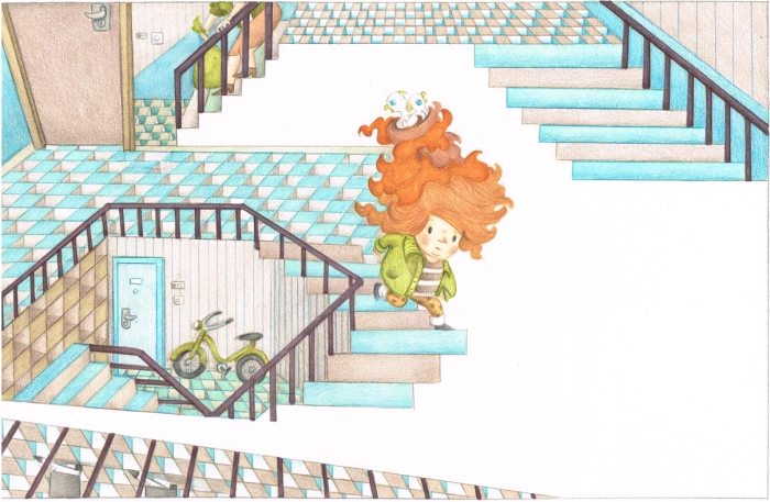
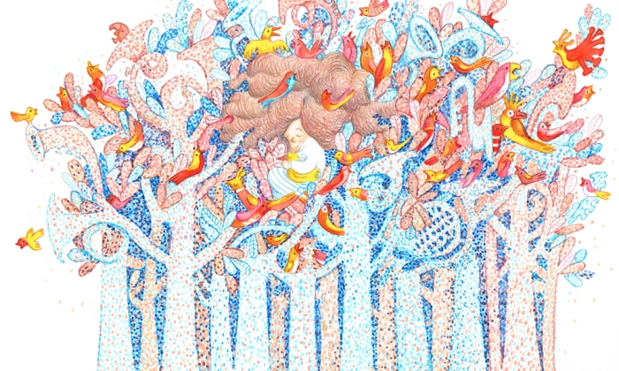
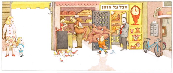
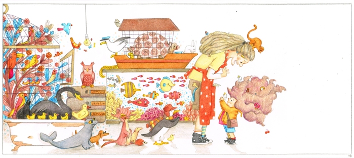
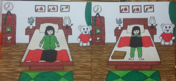
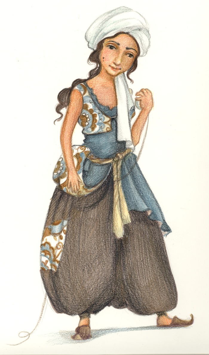
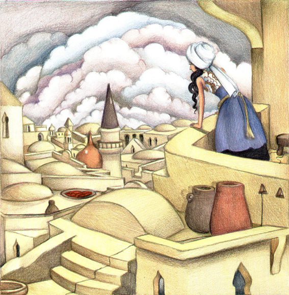
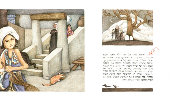
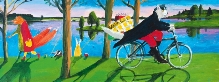
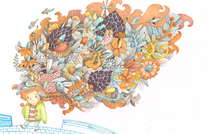
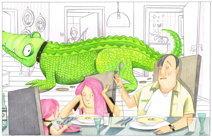
Amalia wants a pet, By Yael Ichilov, Am-Oved 2014 – Concept drawing
7
Amalia wants a pet, By Yael Ichilov, Am-Oved 2014 – Final drawing

More importantly – it enables me to figure out the book for myself. I usually make more than one, and I work very hard on each version. Once I have it figured out, everything else is relatively easy.

Shiraz and the enchanted string, concept drawings and visual researchריטה 4ריטה 2

The story of Shiraz is based on a traditional Persian tale, but it also has a European version, written by The Brothers Grimm. I went for the original middle-eastern theme, and started researching buildings, fabrics, and other authentic attributes of the Middle-Eastern culture.  then I tried to combine it with old Persian art and design.

At first I chose a very young girl to be the hero of the story. Then I discussed it with the author, who had someone way older in mind. (It’s a version of “Cinderella”, so the girl must be eligible for marriage, by current European standards).  I found a beautiful  girl of Persian descent who attended my Thai-Chi class,

גלית גיסו

and tried again.

SHIRAZ

Now I needed to place her in the right surroundings.

shiraz 1lr

And finally, I wanted to see if I could create a full-page image – including design and illustrated typography. I wanted to achieve the fluency of the traditional, beautiful, Arab typography – although it is essentially different from Hebrew.

liora

My name in 3 different fonts in Arabic.

ריטה 72

However – all this effort did not pay off. the author thought the art was “Too specific”, and went another direction with a different artist. I’m still proud of it though. I’m dying to do something with a middle eastern theme. Meanwhile – my students do it for me. That is a tale for another blog, another time.  You never tell the full story in a beautiful, Arabian night – or you’ll get yourself beheaded, and I’m kind of fond of my head…

Technique classes

So, lets talk a little bit about the new program for Arab illustrators in picture books  I developed. It started 3 years ago. I have curated a large retrospective exhibition of Israeli illustration since 1948-2013. I noticed that though there is a large book industry in Israel – featuring many wonderful artists, authors, publishers etc. – There isn’t much going on in Arab children’s lit. I wrote a note to self to get to the bottom of this, but life, as usual, took over. 2 years later I was offered a job by Ala Hlehel – An author, an artist and a publisher, that was made the head of the Arab department in  The Israeli Center For Books And Libraries, to create a student program for people who wish to participate in the making of  authentic children’s literature in the Arab language. (There are 2 programs – one for illustrators and the other is for authors). The challenges we face are:

  1. Unlike the Israeli illustrators, who study in the finest academies (In Israel and abroad), my students came from various backgrounds. Some took classes before, others just like drawing and painting, and it’s their first encounter with professional teaching.
  2. Most of my students don’t come from privileged homes. Studying professionally means high tuition and zero guarantees for the future. Even those who come from more privileged families, are sent to study a lucrative profession. That means they do it in their spare time, while working or studying.
  3. Everything about illustration costs money. Brushes cost money, paint costs money, papers, not to mention the common use of computer techniques, that requires softwear, heardwear, a Wacom board, special brushes, you know the drill. That all costs money. luckily, the center is funding many of the manual materials.
  4. A very limited schedule. 10 lessons – 2 hours each, for a basic intro to illustration. They added 5 lessons devoted to various workshops, held by experts I brought on board. an advanced curse will open in 2 months (Stay tuned!). Compare this to any academic itinerary, and you’ll see what I mean.

Yet, this all thing of Arab children’s lit. in Israel is completely new. We are bound to make hideous mistakes, but hey – I embark on this new amazing adventure, and deliver a new generation of illustrators, untainted by whatever is going on in the art world around me. I was thrilled (wouldn’t you be?)

So. 10 lessons. Wow. Here is how I tackled it:

first lesson: I brought my ginormous collection of picture books. Let everyone browse through them. Huge problem – people were exposed to the most amazing illustrators of the world. How do they get to even come close? “well, I don’t want you to come close” I told them. I want you to create something else. You get to make many mistakes. You must make them, in fact. That’s how you get places. Just be sure to go to a place of your own”. their first homework: i distributed notes in an old hat. Everyone got a place in the world. they were asked to research it visually, and put everything they find on a disk-on-key.

2nd lesson: We watched and discussed the various presentations. We watched a short presentation I made, about the way the Arab world is represented in art. Through many centuries (Especially the 19th century, that was all about Orientalism)  Arabs would be linked with images of wild beasts, women abuse, drugs, etc. I told my students that if they didn’t like it – it’s up to them to change it. Their home tusk: How would little red riding hood look like, had she lived in the country they researched. I wanted them to understand how a place can effect the look and image of an illustrated image. Create a link between ethnicity and culture. Later, they will use it to explore their own heritage.

3rd lesson:


First blog post

My name is Liora Grossman, and I am an illustrator (mainly picture books, but sometimes I do some editorial work as well) . Being an Israeli illustrator – I am  committed to promoting Israeli illustration (Children’s books illustration in particular) – both Jewish and  Arabic. I have curated 2 large exhibitions with the help of the Israeli ministry of foreign affairs. Also, I teach various classes in illustration to artists in the Israeli Arab community. That is a subject I’m very passionate about, as it’s a rare opportunity to assist in delivering a completely new genre in Israeli children’s literature (my students would probably refer to it as Palestinian children’s literature – but I do not deal with politics, just in the art and the

This slideshow requires JavaScript.

cultural aspects of it). I will show you what we have done the previous year (the first year of the writers& illustrators seminar, held by Ala Hlihal, and the books and libraries center), and you can follow us down from there. Since I am a veteran illustrator, I am trying to promote young promising Israeli artists. I will use this blog to shed a light on some of them, so it doesn’t become a “look-at-me-I’m-so-awsome” kind of blog. So join me, and let’s get started.